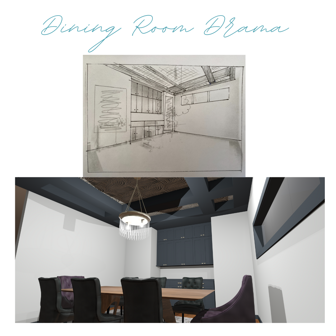
Dining Room Drama: What we have planned for this space
We have recently started working with clients who have purchased a home that was built in 2006. While the home is quite traditional, we will be transforming the entire home to be sleek and modern. So what do we have in store to create some dining room drama?
Dining Room Transformation
As Is
First of all, let's see what the space currently looks like.

Right now, the space is being used as a home office. My clients would like to use this as their dining room.
First Impressions and Ideas
After talking with my client and getting their ideas for the look they wish to achieve for the entire home, this space is most likley going to be my favourite to complete for them. Why? We're going to create some dining room drama!

Cabinets
For this entire home, we are going to be spraying all of the cabinets black. Yes - black cabinets and gold hardware. I said this home was going to be sleek and sexy, right? Here are a few of the colours we are looking at.

Now, you might be thinking there is no difference between any of these however there are! We're going to find the BEST black to use for the cabinetry in their home.
We recently used a really great black for cabinets and a fireplace in this project.
Ceiling
Oh, the ceiling! Right now, the plan is to paint the grids black and fill in the spaces with wallpaper. Can I get a heck yes! Remember....sleek and sexy!
Here are some of my initial options for the ceiling.

Walls
For the walls, we are going to use a very pale grey colour. This will be our very last selection we make. Yes - paint is ALWAYS the last item to be specified!
As you may see on my very rough sketch drawing, I am specifying two large pieces of art for this space.
Floor
Right now, there is a tile inset floor in this space. The tile is very 'Tuscan' looking. In keeping with a good investment budget, we are going to keep this flooring BUT will be sourcing a really great area rug.

Lighting
Currently, there is a very undersized flush mount light in this space. We're going to say good-bye to that light and install a fabulous feature light. And by fabulous, I mean it will be the focal point!
I've sent my client some initial ideas and this one has truly caught our eye!

Pulling it all together
I always like to to pull together rendering to give the idea of what it's going look like. As you will see, the light in the rendering that does not look like the one above. The 3D rendering is just to get the idea of what the space is going to look like.
Ready to see?


We'll be starting this project in a couple of weeks and I can not wait. Be on the lookout for the updates!


