ONE ROOM CHALLENGE™ WEEK 6: TILE AND LIGHTING
We officially have two more weeks of the One Room Challenge™ and things are going according to plan. If you haven’t had a chance to follow along, our previous posts can be found here:
If you are new to what the One Room Challenge™ is, it is an event for the design community. The ORC™ is currently in its thirteenth season, and this challenge is a widely anticipated biannual event every April and October. Every Wednesday, the designers document their process while sharing their sources and professional advice over the eight weekly posts. You can see all of the participants here.
This spring, Apartment Therapy is the official media sponsor as well!
TILE
When we decided on the final design plan for our ensuite, we went with the decision to make a pony wall between the toilet area and the shower. This is one element that the Mister really wanted to have in our space. He loves the way the light is going to flow through our entire space.
Since you will be able to see the entire back wall, it was an easy decision to have that full wall tiled. What wasn’t easy, was making the decision as to what that tile was going to be.
And just for the record, the Mister is getting a number of things in our space. I’m a huge believer in sharing the dream.
Tile Options
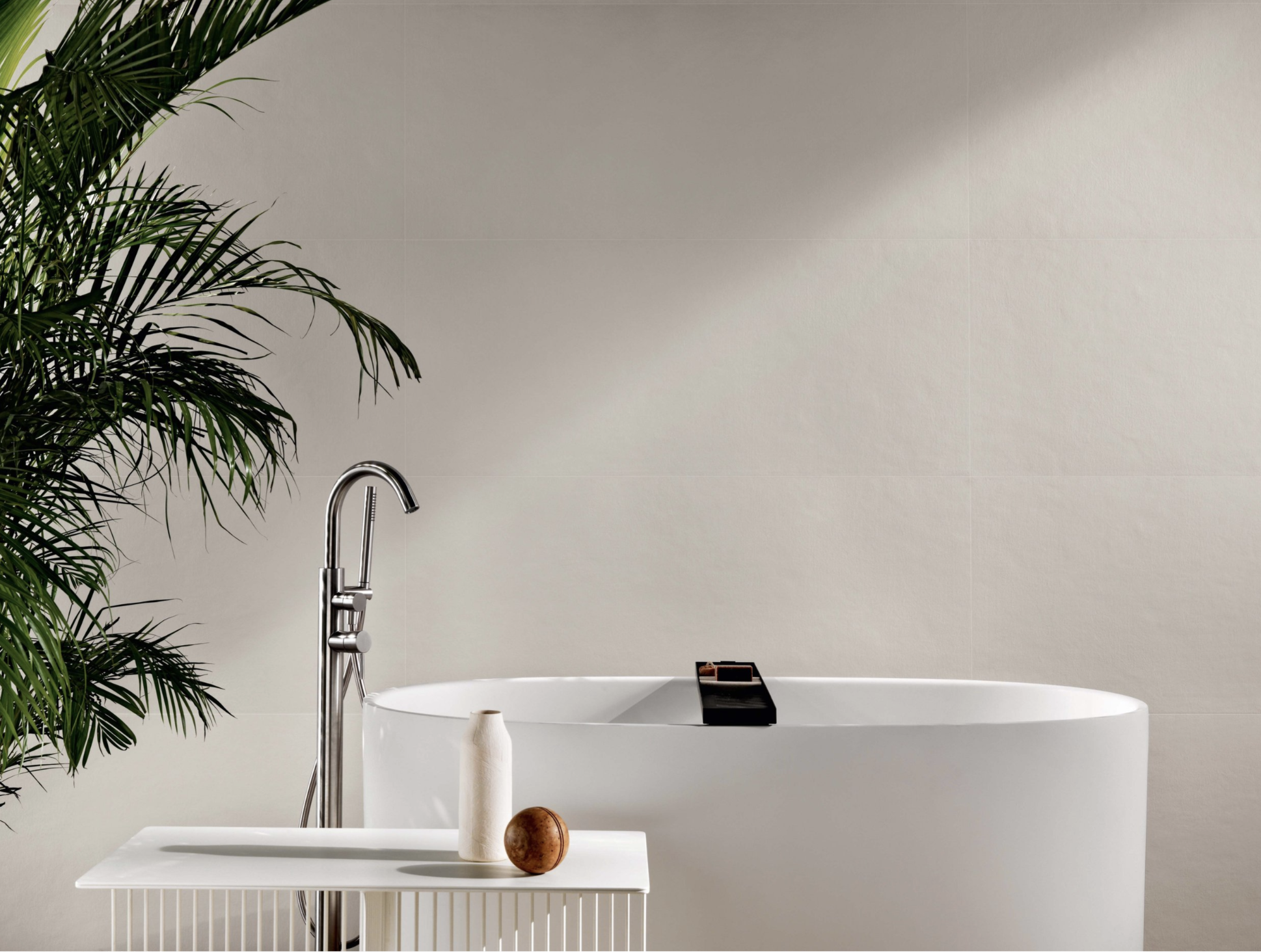
When I first saw the tile family below, I knew I wanted to use it. I love the organic look and feel of this tile. What drew me to this tile is Zen feeling.
While I absolutely LOVE this tile and the entire series of this tile, I wasn’t feeling the excitement when I brought it home. This is one thing that I always do with clients. I make sure we bring the product home to see what it looks like in the space that it will go into. I really hope that one day I can utilize this tile in a future project because I didn’t end up selecting it for our space.
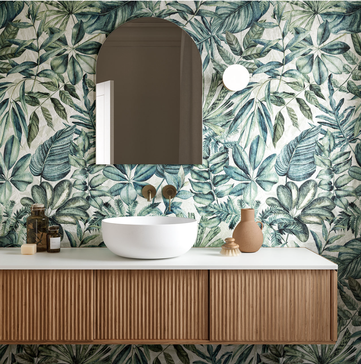
There were a couple of tiles that I wish I had the guts to use in my own home, but I just shied away from using them as it didn’t fit with the vibe we were going for. The tile below is from Ames and it is spectacular! The tile is 24” X 48” and is meant to look like a mural.
Ames Tile 24"X 48" EXOTIC SPAZZOLATO (SEMI-POLISHED)
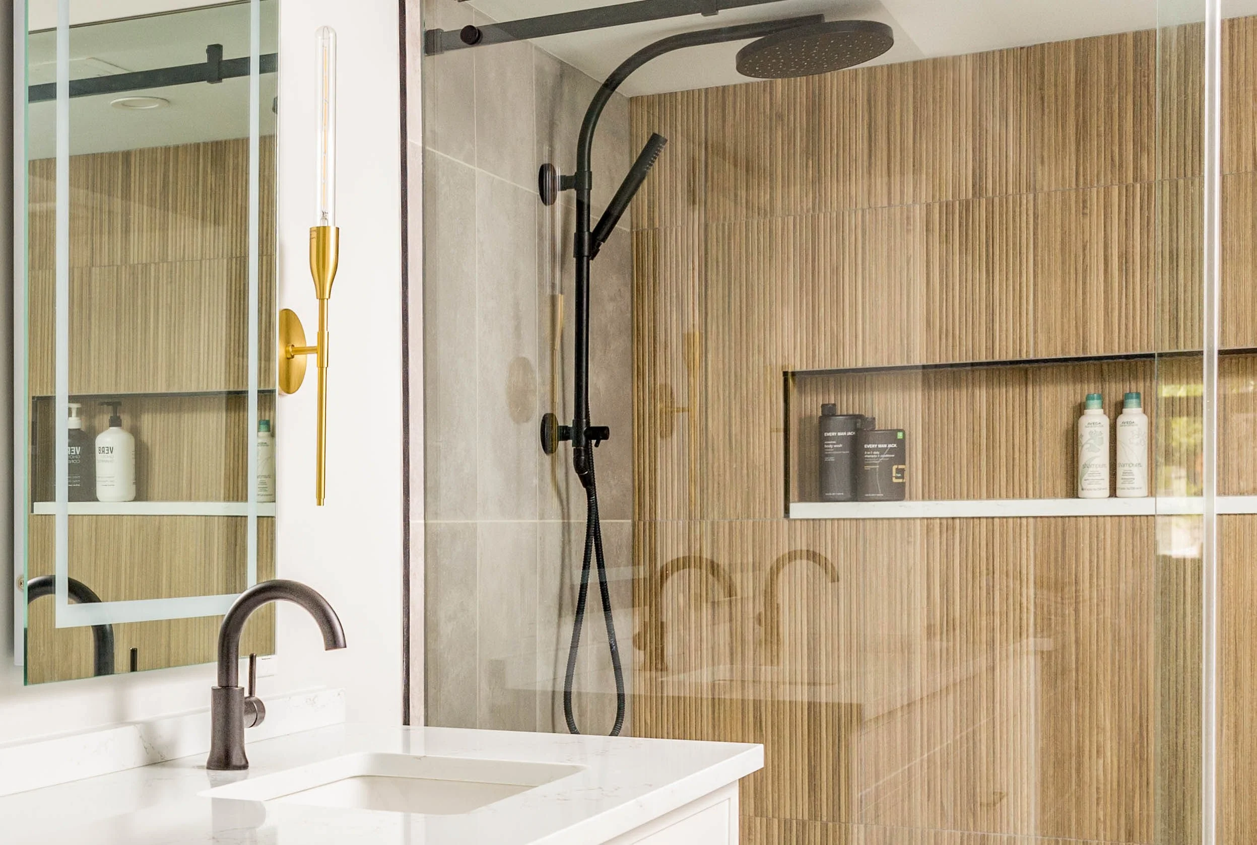
The tile for the ‘feature wall’ that I kept coming back to was one that we have used in a past project. This fluted tile can give the impression of wood (especially from a distance). I love the organic feel that this tile gives off.
A past project of ours with the same tile we will be using for our feature wall, but in a different colour.
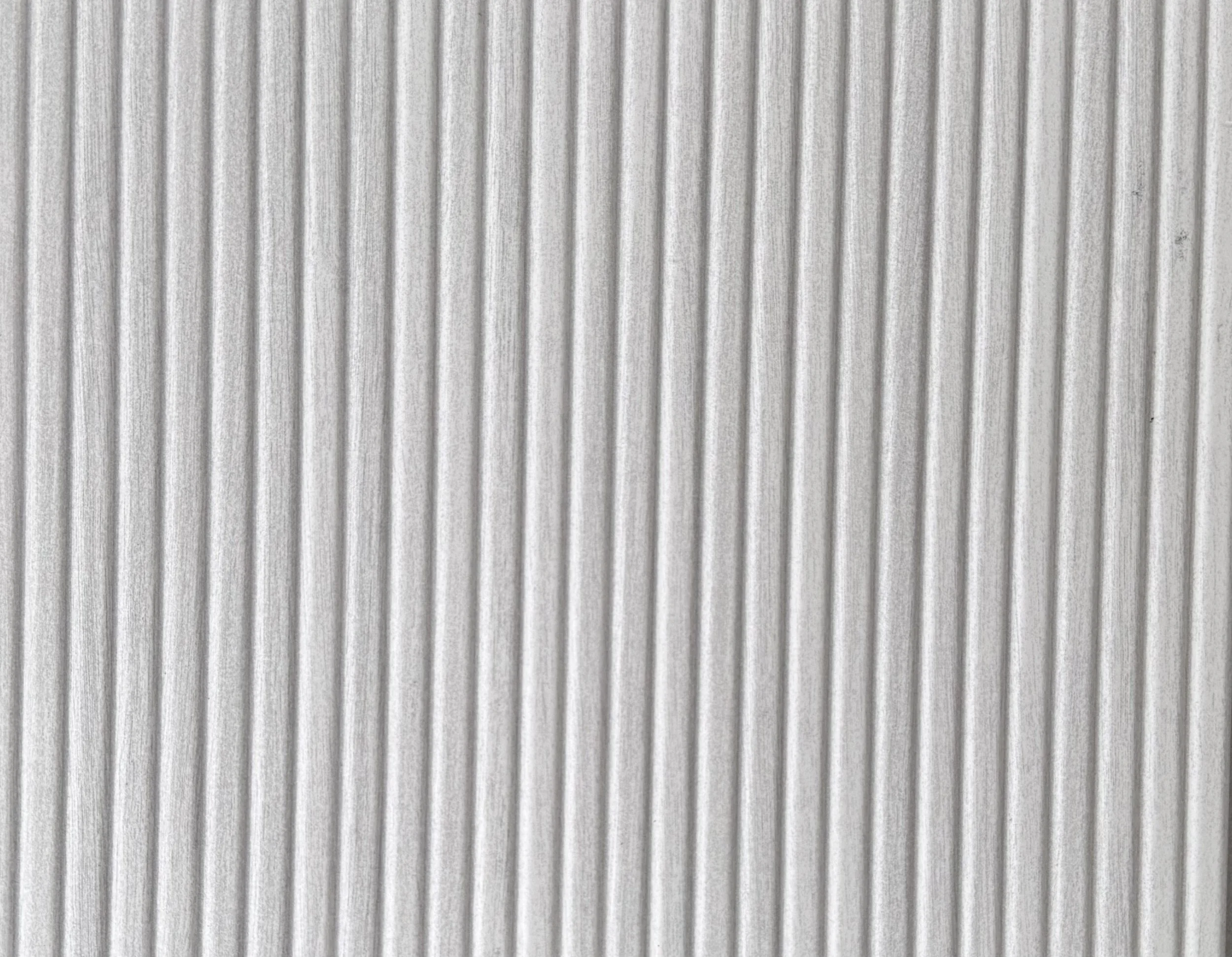
While I didn’t select the above tile, I did select one from this family of tile in a lighter colour. And please note, the colour of the image below does NOTHING for this tile. In person, this tile is one thousand times better!
Feature Wall Tile
Zen White Wood Clad 12x40" Ceramic Wall Tile
I then decided to use 24”X24” floor tile. I chose a larger format tile as I didn’t want to have a lot of busy, grout lines.
Floor Tile
Sahara White 24x24" Matte Porcelain
For the shower, due to the way we are installing our bathtub, we have a ‘custom size’ shower. I wanted to use the same tile as the floor and have our tile setter cut it to allow for drainage like the image below.
Tile for shower floor that I was hoping for.
This is from our Denver project. It’s important if you are going to have this kind of shower floor installed that the tile is non-slip (which ours is).
When I mentioned this to the Mister, he really had his heart set on a stone shower floor. To be honest, I’m not a huge fan of this floor as all I think about is cleaning. When I was mentioning this to my tile rep, he assured me that the tile sealer has come a loooong way and that if it was sealed properly, we would have no issue. While we will need to reseal it at some point, I have been promised that it won’t be a cleaning nightmare. As such, the tile below was selected for the shower base.
Shower Floor Tile
Bali Harmony Warm Blend Flat Pebble
I’ve added in the wallpaper that I selected last week to give a sense of how this will look. Putting all 4 elements together you can hopefully see a serene palette for this ensuite.
While the fixed elements are a bit ‘vanilla’ and some might say boring, I’m bringing in colour with our vanity as well as all of the other decor items.
Next week, I’ll be sharing the custom closet and how we came up with the design for that space.
We are regularly posting on our Instagram page and stories with our project as well if you wish to follow us there.
