From Dumping Ground to Family Zone
Erasing every trace of this basement's former life took creative thinking and smart design touches. This article was written by
 by Becky Harris Houzz Contributor.
After years of this single father being on his own, his basement had become a dumping ground for unloved furniture and old toys. But when he and his children began making plans for his fiancée to move in, it was time to revamp the space to accommodate movie nights, board games and other family activities.The fashion-forward couple was looking for something more than the typical contemporary basement. Despite having a small space to work with, the family stuck by their desire for a large sectional that everyone could cozy up on together and watch TV or warm themselves by the fireplace. This basically dictated the layout and forced designers Ammar Steven Alshash and Bethany Gale to get creative with smartly chosen furniture, contrasting textures and scales, and design tricks that made the space feel larger. He topped the basement with fresh, sophisticated decor that has subtle industrial touches for a modern yet comfortable feel.Basement at a GlanceLocation: Edina, Minnesota (suburb of Minneapolis)Size: 400 square feetBudget: Approximately $10,000 for furniture and $10,000 for finishes (carpet, tile etc.)

|
|
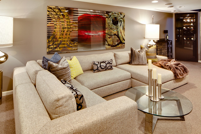
AFTER: A large sectional sofa was the family's number-one, nonnegotiable request. "They wanted to cozy up on a sectional, which had to fit everyone and allow them the option to choose TV or the fireplace without moving," Alshash says.Sectional: custom, Della Robbia; carpeting: Unique Carpets; floor lamps: Global Views; end tables: Arteriors; fabrics throughout: Osborne & Little, Romo and Garret Leather
|
|
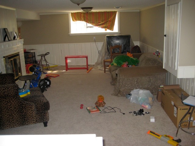
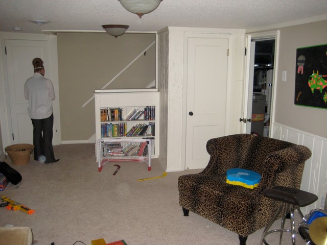
The staircase area was not a good use of space.
|
|
|
"The couple found an art piece from CB2 and said they wanted something like it, but on steroids," Alshash says. He tracked down the artist of the CB2 piece, Jordan Carlyle, and commissioned him to put together this edgy work for the room."My team and I constantly attempted to fool the eye with several overscale pieces that were mixed in height," Alshash says. "The sectional and floor lamps, for example, have large footprints but sit low, making the space seem larger than it is."
|
|
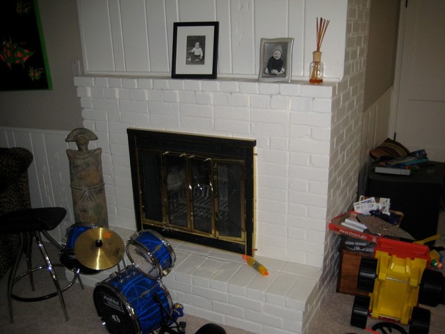
BEFORE: The fireplace did not have much of a presence in the old basement.
|

|
|
AFTER: It got a big facelift with a new ceramic tile surround and tall sculptures that give it a larger, more modern presence. Its scale now stands up to that of the adjacent TV screen.
|
|
|
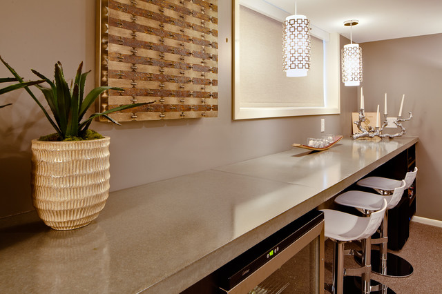
A poured concrete countertop furthers what Alshash dubs "a subconscious industrial setting." The long horizontal line it creates also helps trick the eye into thinking the space is larger.Bar stools: Calligaris; sconces: Jonathan Adler
|
|
|
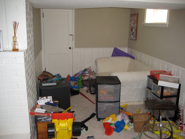
BEFORE: This small area off the main space was the right size for a banquette.
|
